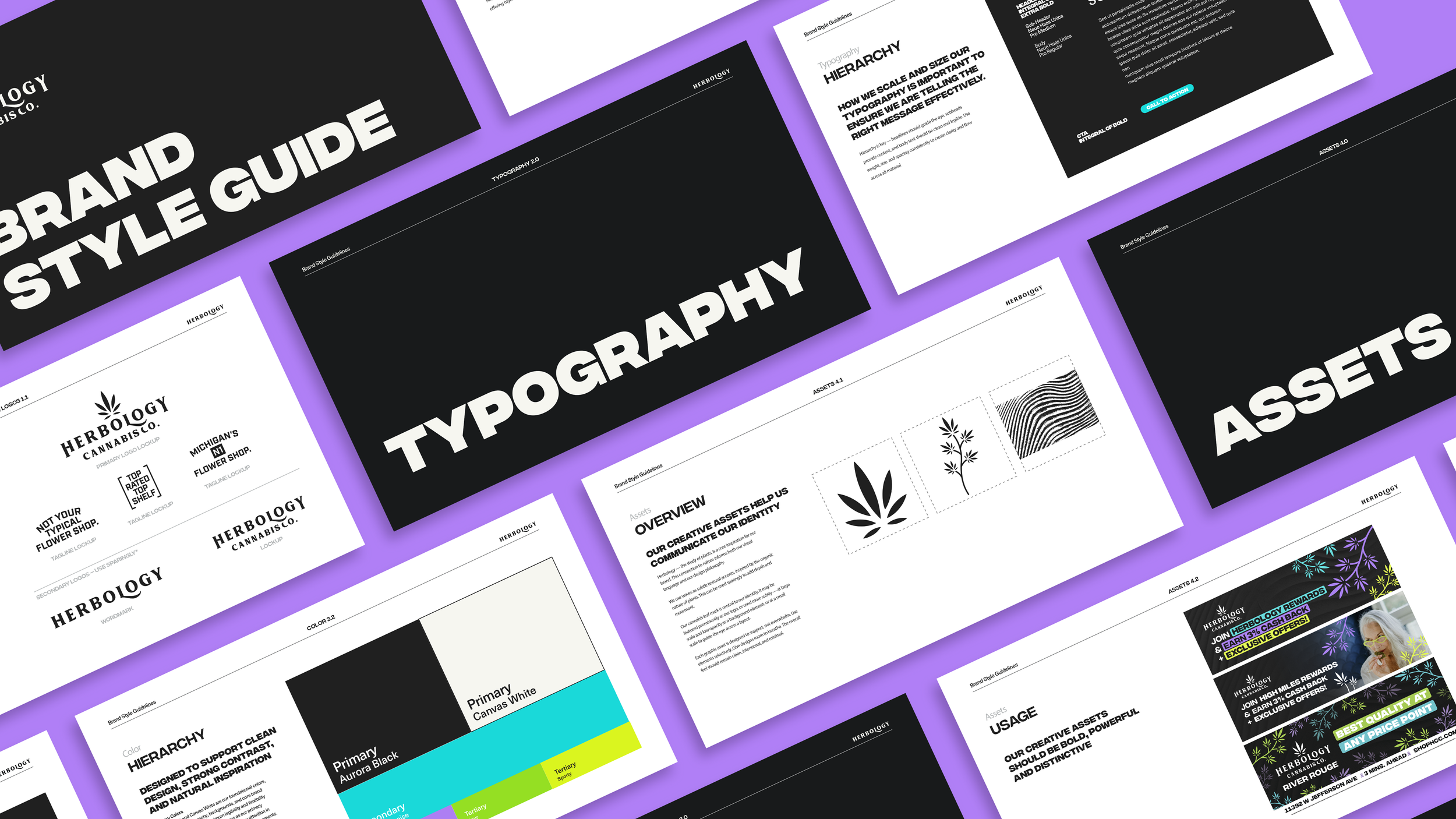
Herbology Cannabis Co Brand Refresh
An overhaul of Herbology Cannabis Co’s Visual Identity.
Years
2026
The Problem:
Herbology Cannabis Co was in need of a refreshed visual identity to better reach target audiences in an extremely competitive market. Their branding was previously targeted at a young demographic of customers newer to cannabis, but over time the data indicated that this was in actuality not their primary audience. In short, the brand was not speaking to new or existing customers, so a solution was needed.
The Solution:
To resolve the issue and drive sales, I utilized customer demographic research to inform my decisions in altering their visual identity; resulting in a more inviting, relatable, and approachable tone for their core customer base. In order to refresh the brand while staying true to Herbology’s roots, the logo remained unchanged, and all new elements included a nod to the original visual identity.
The definition of the word “Herbology” is the study and use of plants for medicinal and therapeutic purposes. To lean into this, organic shapes and textures were included to call back to Herbology’s holistic roots. Bold yet soothing new colors were included to reinforce the idea of both confidence and trust (two very important anchors for customer retention in the cannabis market).
The Result:
The result of this is not just a new and improved look, but a stronger, sleeker tone that strongly resonates with the correct audience.
The brand refresh was implemented in late May of 2026, roughly one month before I write this now. It is still too early to have all the data, but Herbology has seen an increase in sales and new customer rates that seem to directly coincide with the roll out of their new visual identity.
Refreshed Graphics
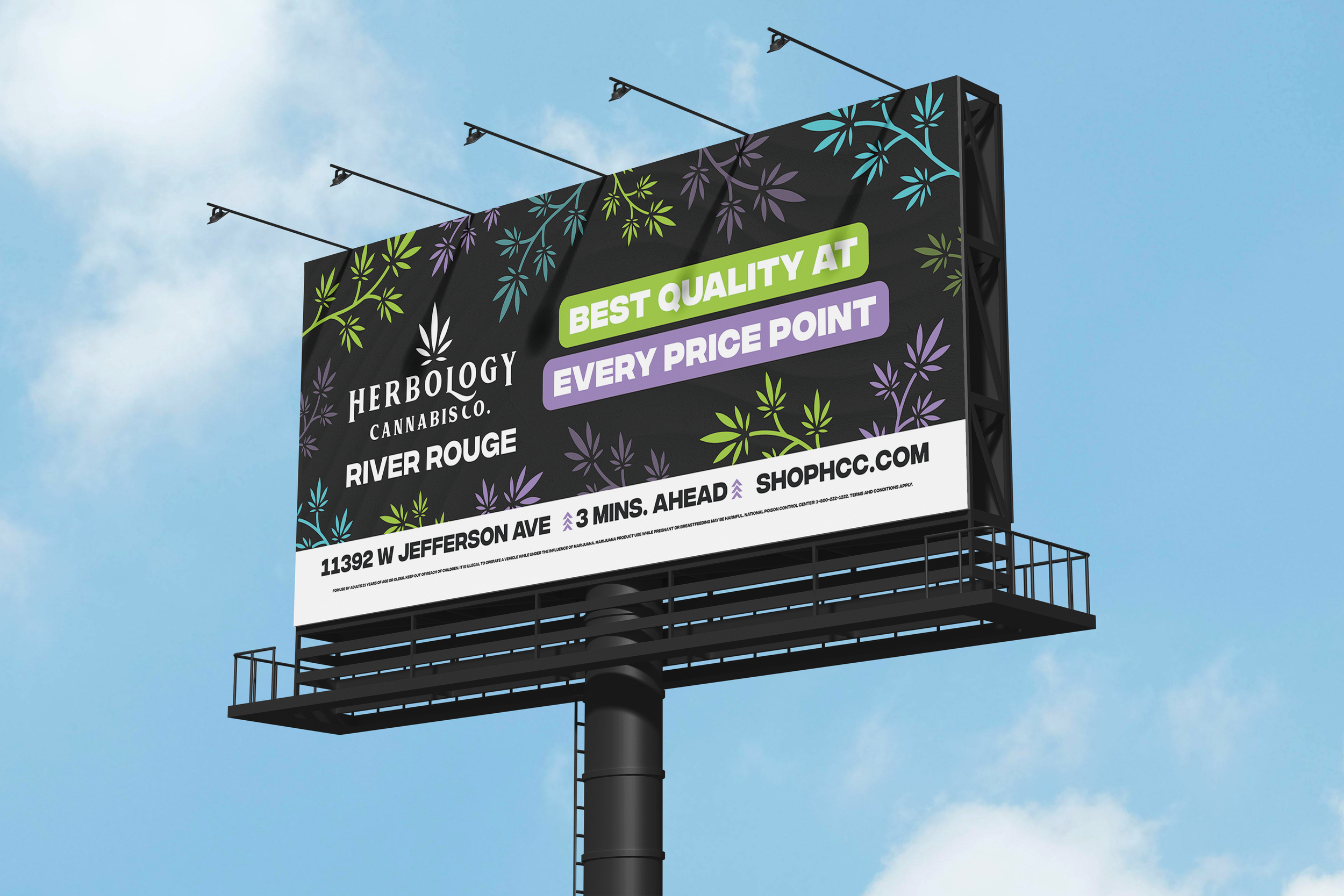
Billboards before:


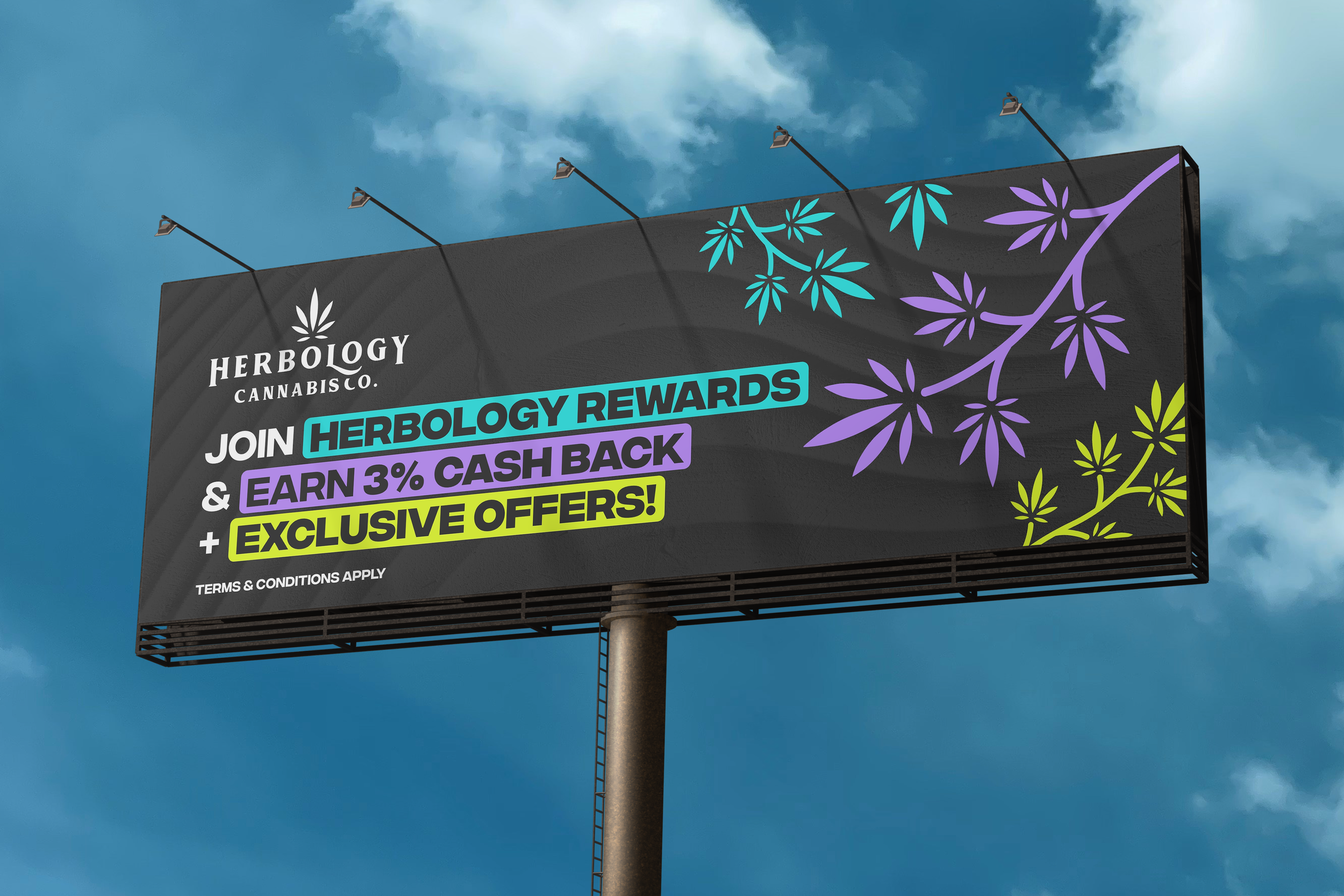
Billboards after:

Banners before:

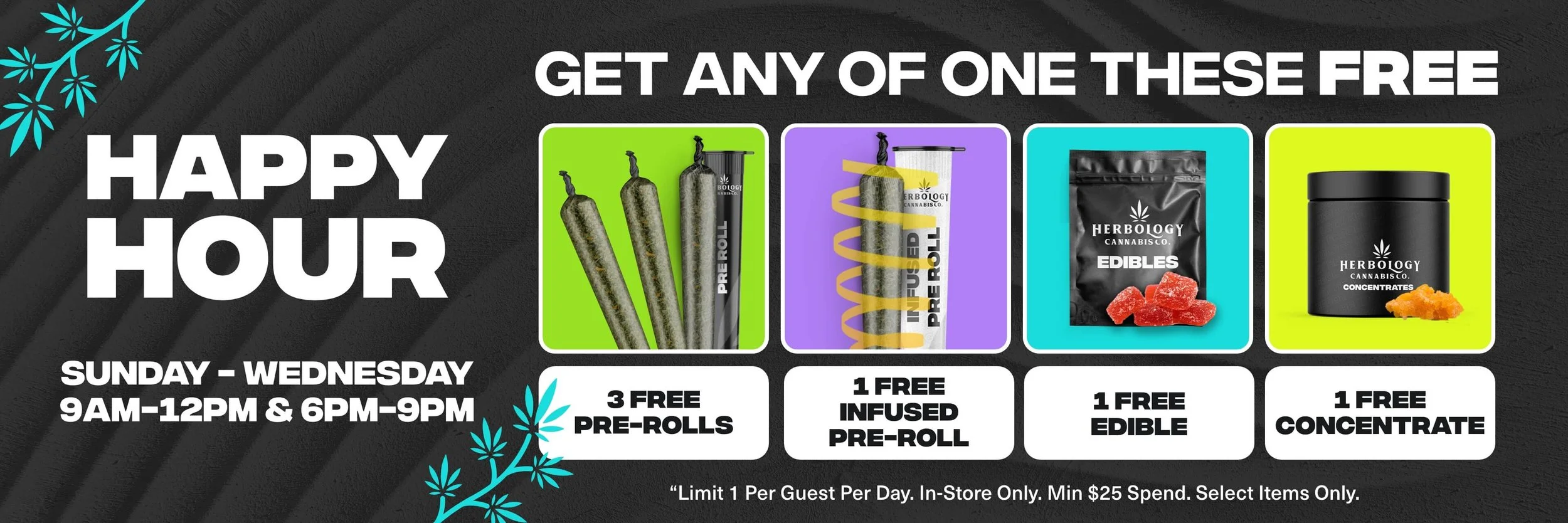
Banners after:


Print before:
